In The account aggregator, when you click on any account other than jupiter the bank page appears.

Now as you can see there is a menu button on top right. This is the first time I am seeing this element, no other section of the app has this kind of Ui element.
It creates an inconsistency in the design language. When I tap on the button, there is only one option to remove the account. I think if there is only one option, then we could have a small trashcan icon here.
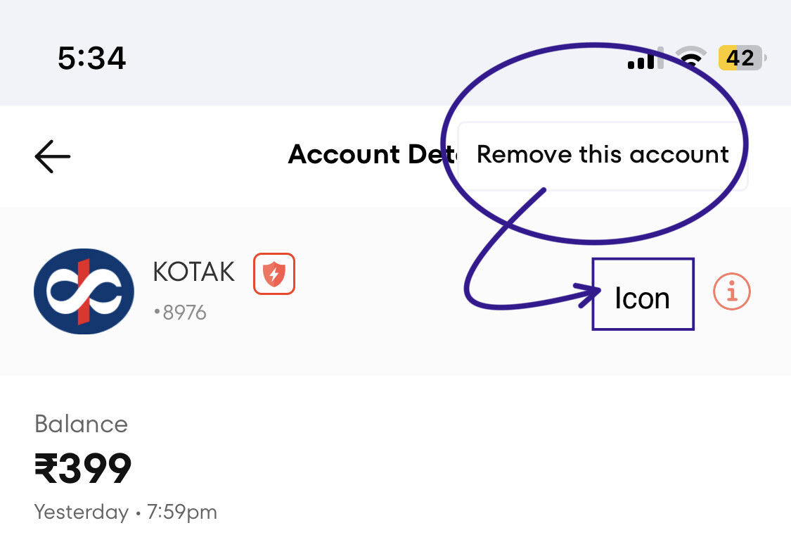
I understand its a very small change, some might not even observe this. But i fear that later there will be more such buttons and the consistency in design language will be broken. I don’t blame the designer behind this page but as a feedback I can point it out.
Other than that the UI looks beautiful ![]() .
.